New Interactive Features! ⭐
Note: Remember to clear your web browser cache if you can't get a new feature to work after upgrading to a new version.
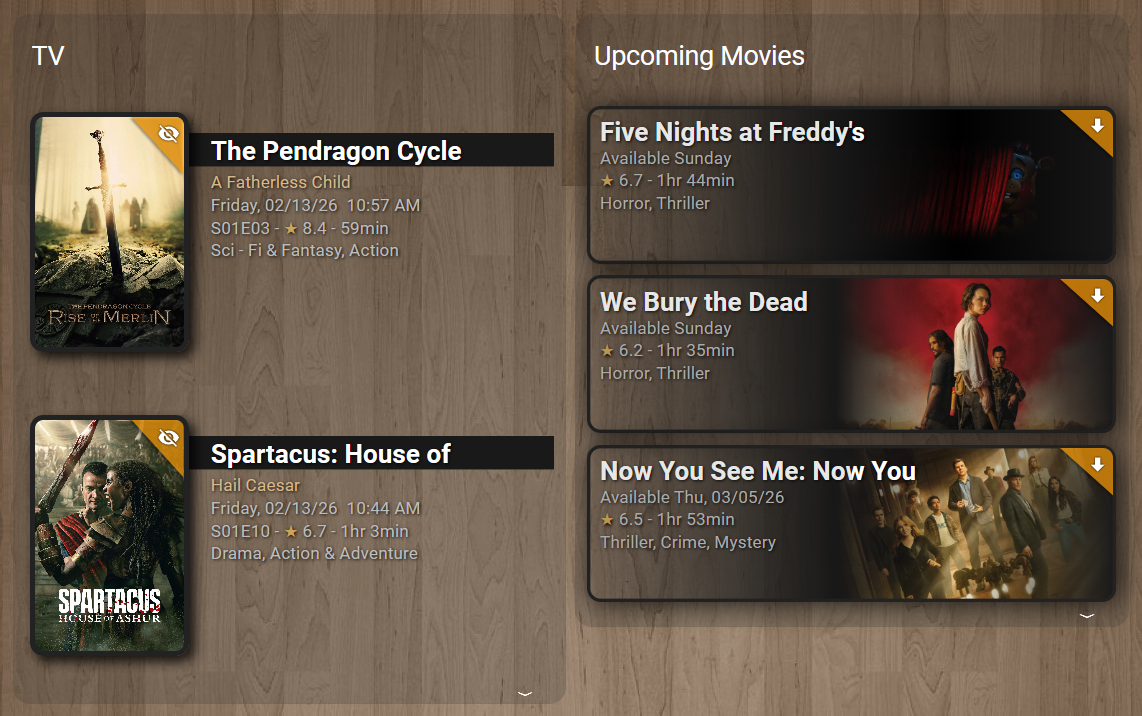
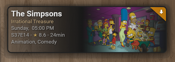
Add rounded corners to each media item using the corner_radius setting. The radius value controls how rounded the corners appear.
title: TV
type: custom:upcoming-media-card
entity: sensor.recently_added_tv
image_style: fanart
corner_radius: 10
By setting corner_radius: 10, all items in the card will render with uniformly rounded corners. Increase the value for more pronounced rounding. Omit the setting or use corner_radius: 0 to keep the default square corners.
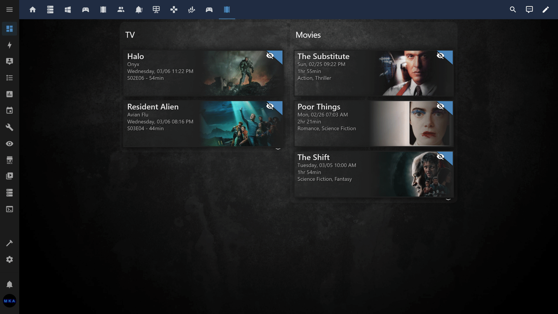
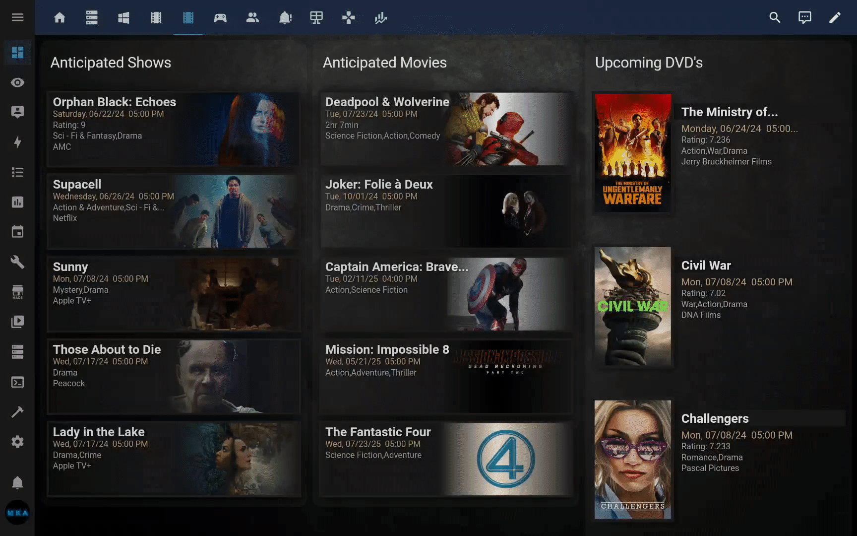
Group items with common attributes together, e.g., group Unwatched  items first. The rest of the items can be collapsed/expanded:
title: TV
type: custom:upcoming-media-card
entity: sensor.recently_added_tv
image_style: fanart
collapse: flag=true
corner_radius: 10
sort_by: number
enable_tooltips: true
By setting collapse: flag=true, items not yet watched are prioritized and grouped at the top. You can expand/collapse the rest of the items. Alternatively, you can specify, I.E., collapse: 2 to collapse/expand everything after 2 items (regardless of what items are displayed).
Note: You can also leverage the new sort_by setting as a secondary sort method (season/episode) sort order.
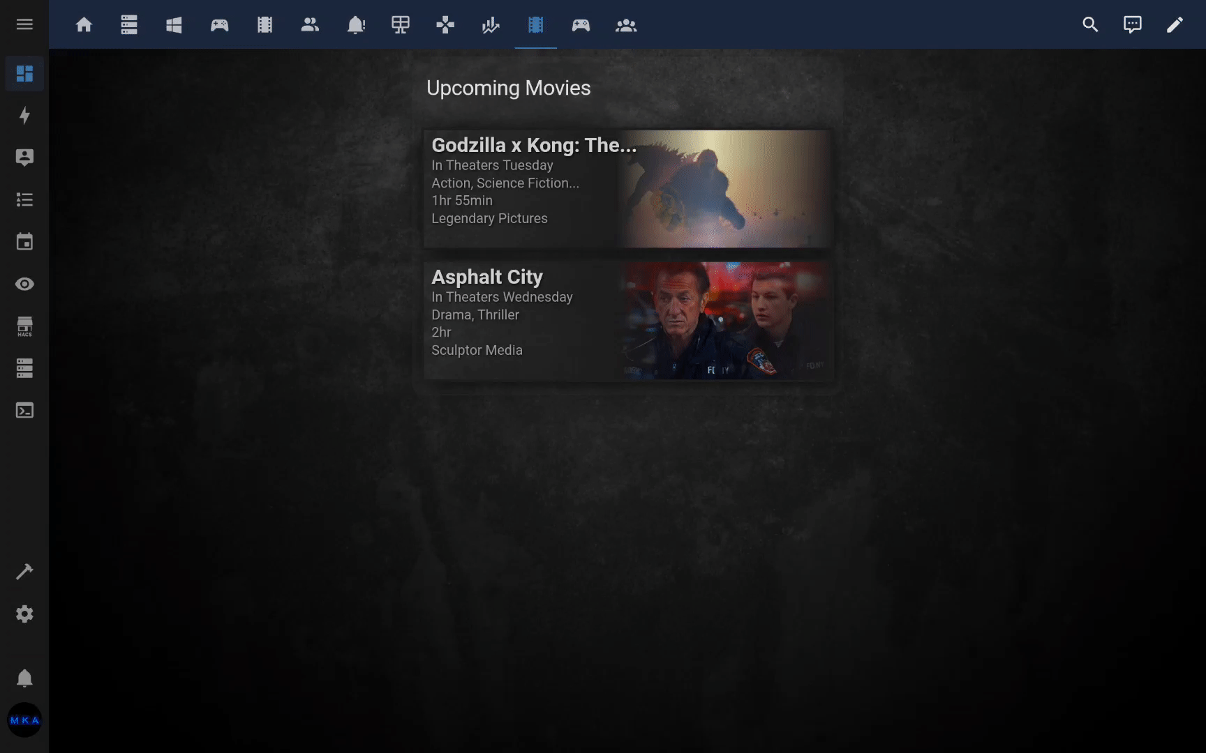
Automatically arrange media items into multiple columns that fill the available viewport height using the overflow setting. Items flow into as many columns as needed, dynamically recalculating on window resize. You can optionally limit the number of columns with the max_columns setting.
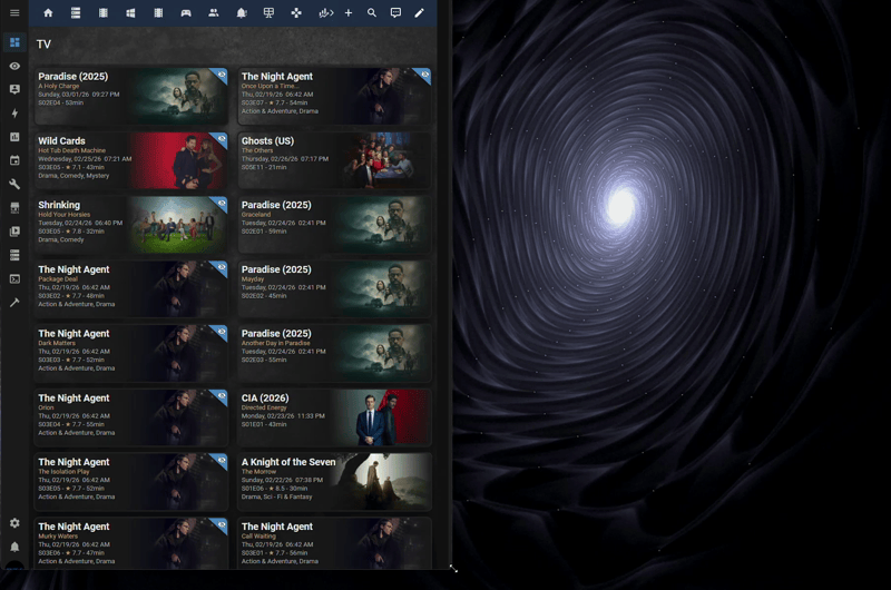
The example above is using a Home Assistant Panel dashboard. Overflow mode also supports other dashboard views such as Sections and Masonry.
title: TV
type: custom:upcoming-media-card
entity: sensor.recently_added_tv
image_style: fanart
overflow: true
sort_by: flag
sort_ascending: false
max_columns: 4
corner_radius: 12
By setting overflow: true, items are distributed into columns that fill the visible area. Use max_columns to cap the number of columns (1–6). Omit max_columns or set it to 0 to allow the card to use as many columns as it needs.
Note: The overflow setting is mutually exclusive with collapse. Enabling overflow will disable collapse, and setting a collapse value will disable overflow.
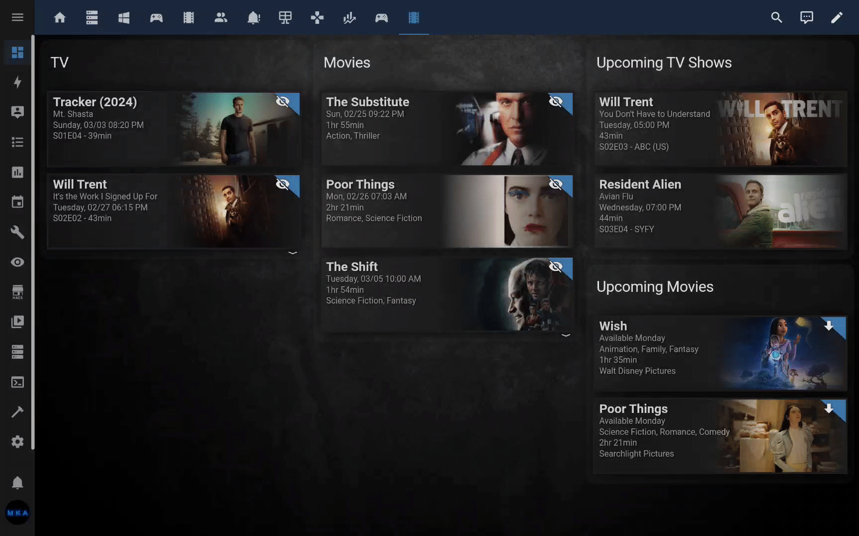
Navigate directly to the respective TV episode, movie, game, etc. with a single click or touch! Made possible with the new deep_link attribute.
Create custom clickable links using the url setting with keyword substitution. Keywords like $title, $tmdb_id, $number, etc. are replaced with actual values for each item.
url: https://www.themoviedb.org/tv/$tmdb_idLinks each item directly to its TMDB page using its unique ID.
url: https://www.google.com/search?q=$title+$number+watch+onlineCombines multiple keywords into a dynamic search URL per item.
Note: The custom url setting takes priority over trailer and deep_link. If no custom url is configured, the original behavior is preserved.
We can finally sort items by any attribute. sort_by: airdate will sort media items by their respective airdates. You can also reverse the sort order using sort_ascending: false.
Filter items by partial or full attribute value. filter: flag=true. Similar to collapse: setting, except discards the rest of the items.
When using enable_trailers:true setting, any item with a trailer attribute value will playback the respective video trailer when clicked or touched.
To enable tooltips, use enable_tooltips: true. To change the default delay, use I.E., tooltip_delay: 2000 (default 750ms).
Activate with enable_transparency: true for a transparent gradient effect instead of the default opaque gradient background.
| NAME | TYPE | DEFAULT | DESCRIPTION |
|---|---|---|---|
| type | string | REQUIRED | custom:upcoming-media-card |
| entity | string | REQUIRED | The entity id of the custom component. |
| title | string | optional | Title displayed at top of card. |
| date | string | ddmmyy | Format for displaying dates. |
| clock | number | 12 | Display times as either 12 hour or 24 hour. |
| max | number | 5 | Maximum number of items to show. |
| image_style | string | poster | poster or fanart. |
| corner_radius | number | 0 | Applies rounded corners to each item. Value is in pixels. |
| hide_empty | boolean | false | Hide card when there are no episodes to show. |
| hide_flagged | boolean | false | Hide items that get an indicator flag. |
| hide_unflagged | boolean | false | Hide items that don't have an indicator flag. |
| flag | boolean | true | Display or hide indicator flag. |
| text_shadows | boolean | true | Display or hide shadows behind text. |
| box_shadows | boolean | true | Display or hide shadows behind objects. |
| all_shadows | boolean | no default | Turns both text and object shadows on or off. |
| enable_transparency | boolean | false | Turns on gradient transparency effect. |
| url | string | no default | Makes entire card clickable with specified hyperlink. Supports keywords for dynamic per-item URLs (e.g., $title, $episode). |
| overflow | boolean | false | Arrange items into columns that fill the viewport height. |
| max_columns | number | no default | Maximum number of overflow columns (1–6). |
| collapse | string | no default | Prioritize/group by attribute value. |
| collapse | number | no default | Collapse all items after N items. |
| filter | string | no default | Filter items by attribute value. |
| sort_by | string | no default | Attribute used for sorting items. |
| sort_ascending | boolean | true | Sort order. |
| enable_tooltips | boolean | false | Display summary tooltips. |
| disable_hyperlinks | boolean | false | Disable deep_link clicks. |