

217 free animated components and backgrounds for Vue.
Tune them yourself, or hand them to your agent.


Documentation · Installation · MCP · Browse components
Vue Bits is the official Vue port of React Bits: a free, open source library of animated Vue components and backgrounds that you copy into your project and make your own.
Each component is a single Vue file written in TypeScript, with its styles alongside it. It drops straight into any Vue 3 or Nuxt project.
Every component has a live demo with controls, works in light and dark mode on the docs site, and most backgrounds come with presets to start from. Search, favorites and a browse page help you find the effect you have in mind.
| Category | Count | What you'll find |
|---|---|---|
| Text Animations | 33 | Split, scramble, blur and morph text, from headlines to scroll-driven reveals |
| Animations | 38 | Cursor effects, hover interactions and reveals that wrap around any element |
| Components | 48 | Carousels, galleries, cards, menus and docks with the motion built in |
| Micro | 34 | Small interactive pieces like toggles, sliders, buttons and loaders |
| Backgrounds | 64 | Shader and canvas backgrounds for heroes and full pages, most with presets |
Add any component with the shadcn CLI:
npx shadcn@latest add https://vue-bits.dev/r/SplitText.jsonOr with jsrepo:
npx jsrepo add https://vue-bits.dev/r/SplitText.jsonSwap SplitText for any component. On pnpm, yarn or bun, replace npx with pnpm dlx, yarn dlx or bunx --bun.
Prefer to copy by hand? Open a component's Code tab, paste the file into your project and install the dependencies it lists. The installation guide covers both.
Render it like any other component:
<template>
  <SplitText text="Hello, you!" :delay="100" :duration="0.6" />
</template>

<script setup lang="ts">
import SplitText from './SplitText.vue';
</script>
The code is yours, so change the styles, props or behavior however you like.
Vue Bits works with the shadcn MCP server, so Claude Code, Cursor, Codex, VS Code and Antigravity can find and add components for you. Add the registry to your components.json:
{
  "registries": {
    "@vue-bits": "https://vue-bits.dev/r/{name}.json"
  }
}
Then connect your client, for example npx shadcn@latest mcp init --client claude, and ask for what you need. See the MCP guide for every client.
Contributing. Ideas and fixes are welcome. Browse the open issues, suggest something with the feature request template, and read the contribution guide before opening a pull request.
Official ports. Vue Bits is a port of React Bits, which is also available for Svelte.
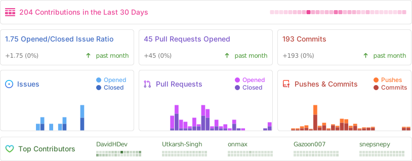
Contributors. Thanks to everyone who has helped build Vue Bits.
You can support the project with the Sponsor button on the repository page. Donations go strictly towards hosting costs.
Vue Bits occasionally draws inspiration from publicly available code examples. These are rewritten as full-fledged, customizable components. If you recognize your work, open an issue to request credit.
MIT + Commons Clause, free for personal and commercial use. Created and maintained by David Haz.